Razer’s Nabu Watch is an unusual device. It isn’t exactly a smartwatch; but nor is it a smartband either. It exists in this space between the two. What it does have is a throwback aesthetic that grabs attention. I wonder if this is meant to appeal to the retro look that is popular these days, or if it shows a lack of creative ideas from a company that has simply been slapping RGB lighting on its products.
What is it?
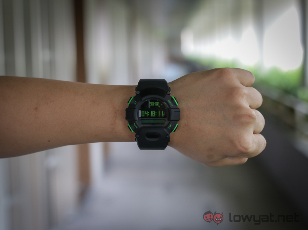
The Nabu Watch is a regular digital watch that swallowed a smartband. That may be the only way to describe it. Watch and Smart functions are not separated by the software; rather they are physically independent devices. Each has its own power source and electronics, which literally makes it a 2-in-1 product. It also makes the watch huge.
Dominating most of the design is the G-Shock style digital watch. Complete with huge bezel and oversized buttons. The watchface itself is reminiscent of the old G-Shock; aside from the addition of a secondary (tertiary?) LCD display just below the time display.
The additional LCD display is the “smart” part of the watch. It is designed to display any additional information from the pedometer or incoming messages. It does this in a rudimentary way, with only the most basic of details appearing. The type of information displayed can be customised and controlled from Razer’s Nabu app.
Is it any good?
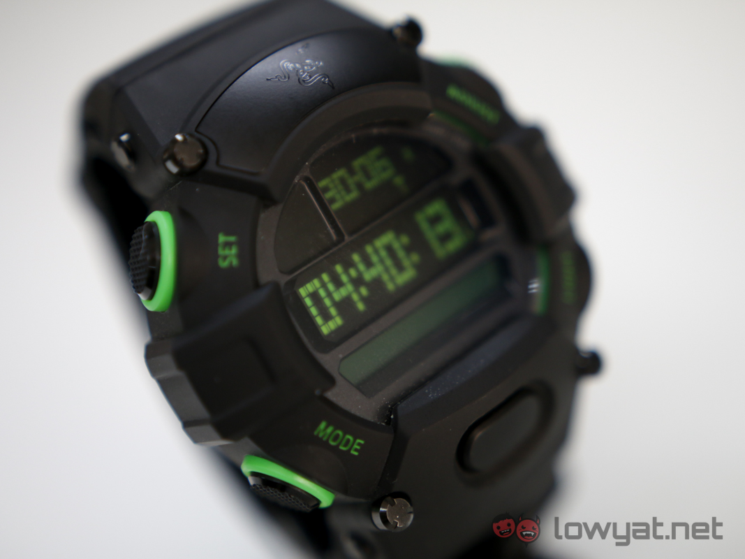
The quality of a smartwatch should be judged on whether it does what it sets out to do. In this aspect, the Razer Nabu Watch undoubtedly succeeds. It is an extremely large and extremely loud fashion accessory that draws a lot of attention. The designers behind the Razer’s stable of gaming peripherals appear to have worked on the Nabu Watch, and it bears the striking neon green highlights.
As far as functions go, the Nabu Watch is a bare bones device. It tells the time. It informs the wearer of how far and how many steps he’s taken in a day. It also has a limited capacity to display messages and caller ID.
Comparing the Nabu Watch to other smartwatches like the Samsung Gear S2 or LG G Watch would be a mistake. It is clearly intended to appeal to a completely different crowd; one that would like to have a watch first and everything else later. In fact, this would be closer to the kinds of smartwatches created by traditional watchmakers; those who play an emphasis on retaining the proper aesthetics of a timepiece.
Of course, the timepiece in question here happens to be something from the 90s. Where everything was designed to be loud and obnoxious. Those were good times.
Of course, the timepiece in question here happens to be something from the 90s. Where everything was designed to be loud and obnoxious. Those were good times.
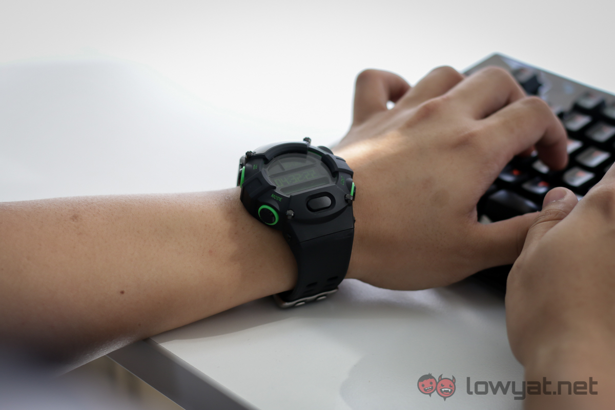
The best part of the Nabu Watch is the impressive battery life. The regular digital watch half of the device uses a traditional dry cell battery, which provides the device with about a year’s worth of power. That’s much better than having to worry about forgetting to charge every other night like other smartwatches.
On the other hand, the ‘smart’ display can go for about a week straight while paired over Bluetooth; which is fairly consistent with fitness trackers from Fitbit.
The bad stuff… Tell me

While the Nabu Watch succeeds at being a watch (because it isn’t that difficult), it struggles with the ‘smart’ side of the equation. The tiny display appears to be designed only for the pedometer, as it is less than suitable for displaying other information. This is especially evident when dealing with a large number of incoming messages.
I have personally been describing the secondary (or was it primary?) display as a glorified pager. You know, those tiny boxes people used to own that were capable of sending short messages. Messages and emails on the Nabu Watch are displayed as a scrolling ticker; provided the messages themselves are short enough. Longer messages simply trail off, leaving the user to go digging for his phone to discover what was actually said.
Another small problem is the limited amount of memory available to the Nabu Watch; which only allows it to store the last five messages received. It doesn’t even retain a counter of how many messages were received. There is nothing like seeing chatter from inane WhatsApp groups and not realising someone has been trying to contact you about work.
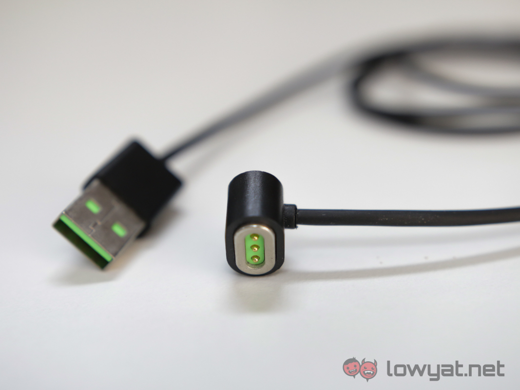
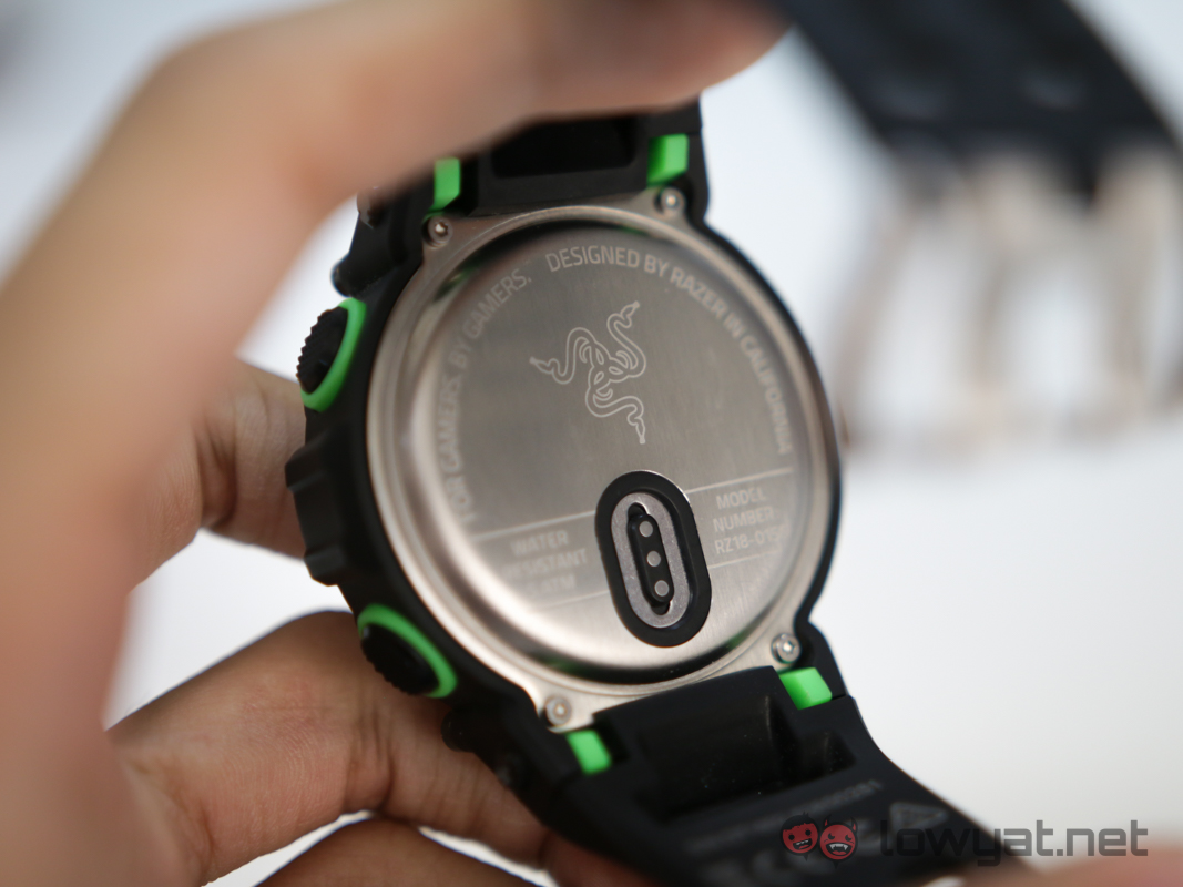
To make matters worse, Razer also made the choice of using a proprietary charging cable for the Nabu Watch. This is a rookie mistake, one that has been made by almost every smartwatch maker. Heck, even the incredibly popular Pebble has managed to stick with a proprietary cable for the last three generations. The difference between Pebble and Razer is that one of these companies provides an easy and convenient way of replacing the cable in the event it goes missing.
Conclusion
The Razer Nabu Watch is not quite a smartwatch; nor is it a smartband either. This makes it very difficult to recommend for people who want either of those devices. The limitations placed on its ability to display or retain messages is a massive strike against the device; this is compounded by the size of the watch which makes it unsuitable as a true fitness tracker.
Then there is the substantial price of the Razer Nabu Watch. At RM999 RM749 it competes with other true smartwatches for customers priced slightly higher, and only provides a small fraction of the functionality. This isn’t the only “smartwatch” to attempt to prioritise being a fashion accessory, and it certainly won’t be the last.
With this in mind, it is a decent first try from Razer. It doesn’t scratch the itch of owning an actual smartwatch, but it does what it sets out to do by grabbing lots of attention.

Looking For Top Razer Smartband in Uae, Razer Nabu X Smartband in Uae, Razer Green Smartband in Uae
ReplyDeletehttps://gccgamers.com/accessories/razer-nabu-x-smartband-green-rz15-01290300-r3a1.html