There are many things we can always count on. The sun always rises in the east, our country is always either hot or rainy all year, and HTC always makes handsome flagship smartphones. It just has a problem selling them.
Will the latest model, the 10, be able to change that?
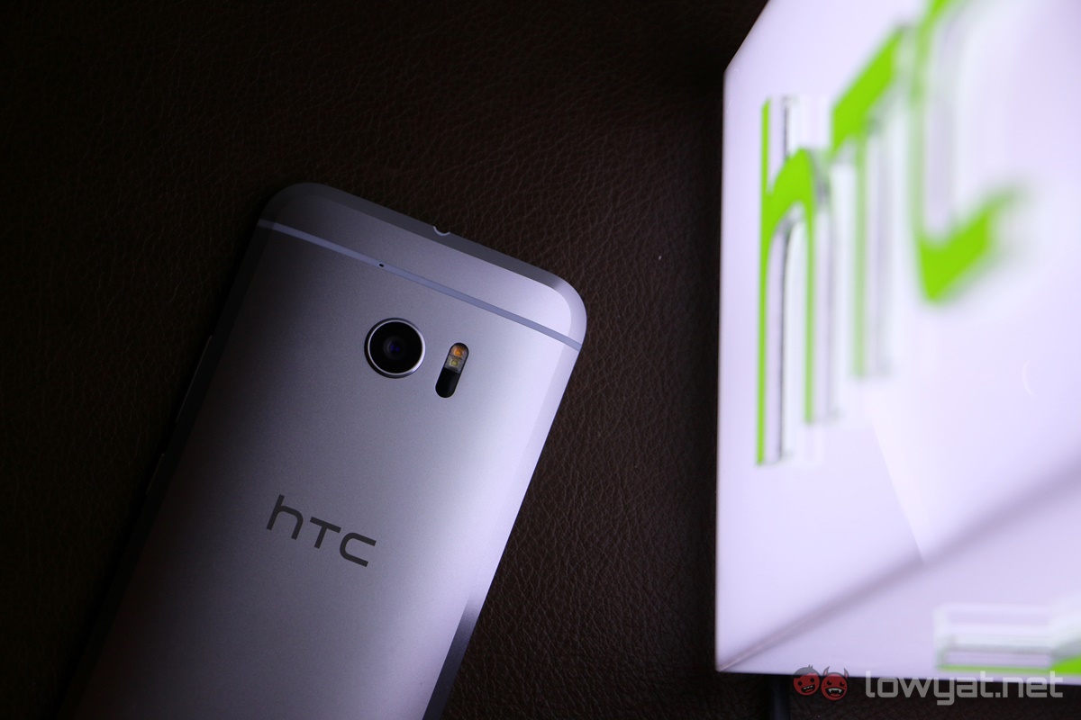
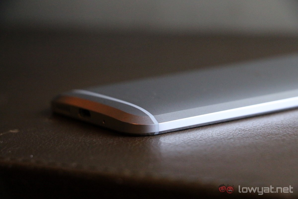
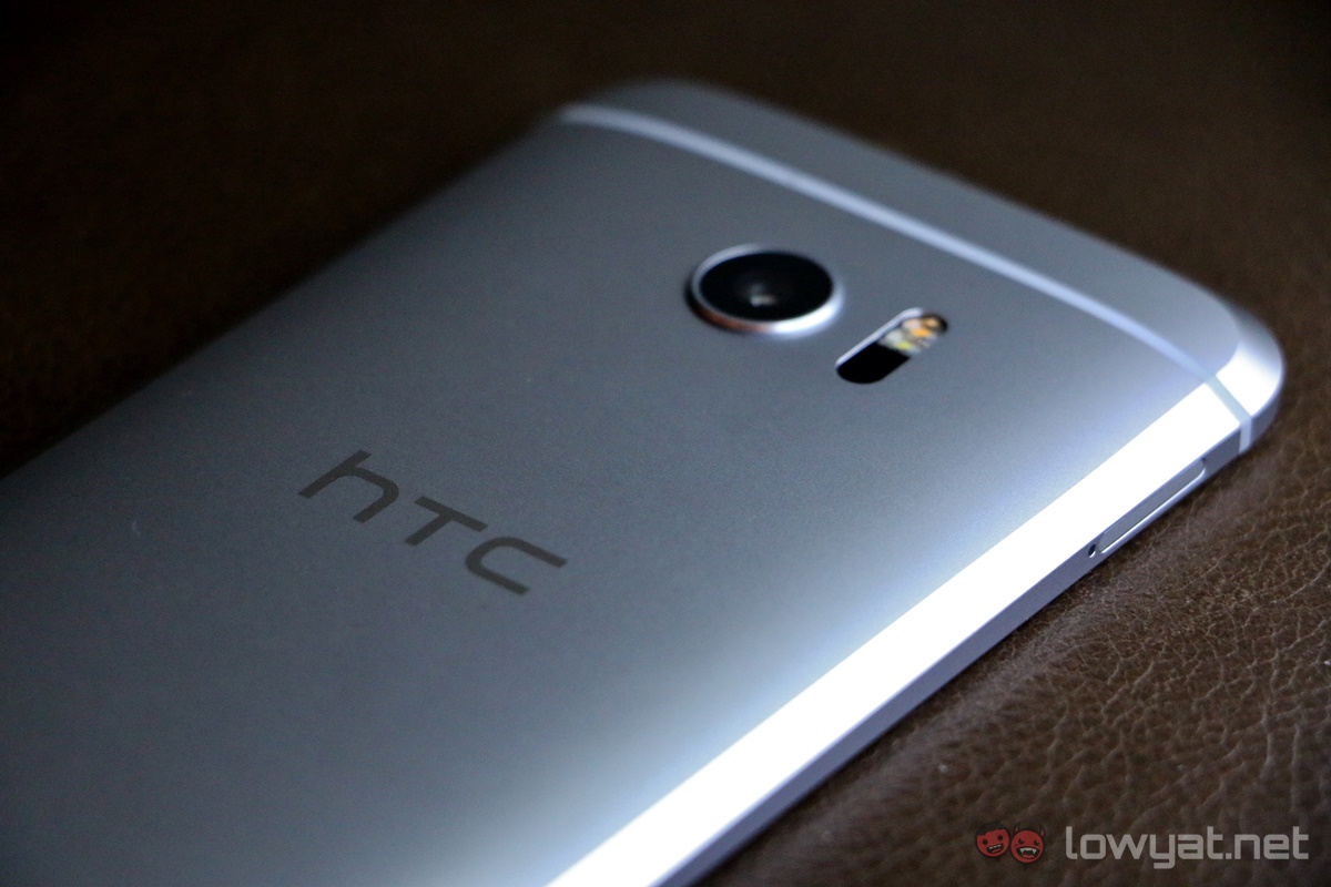
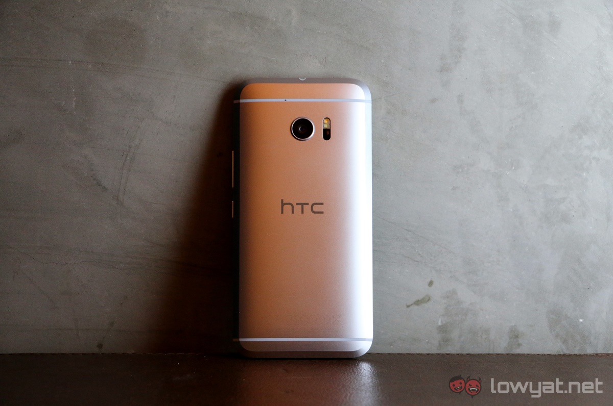
The HTC 10 carries on the full metal unibody design that the Taiwanese company have been famous for since the first HTC One smartphone was released. This time around, there are obvious signs of experimentation as HTC tried to add a new spin to the trusted design.
The back remains comfortably curved, but there’s a thick and odd-looking shiny chamfer near edges; they’re not right at the edge like Xiaomi’s Mi 5 or even the Samsung Galaxy Note 5’s slim chamfer, which lends to a rather distinct-looking smartphone. Unfortunately, it also emphasises the thickness and heft of the device.
Yup, HTC’s One smartphones have always had a solid heft to them, and the 10 is more of the same. It isn’t heavy by any means, but for a 5.2-inch smartphone one would expect it to be a tad lighter.
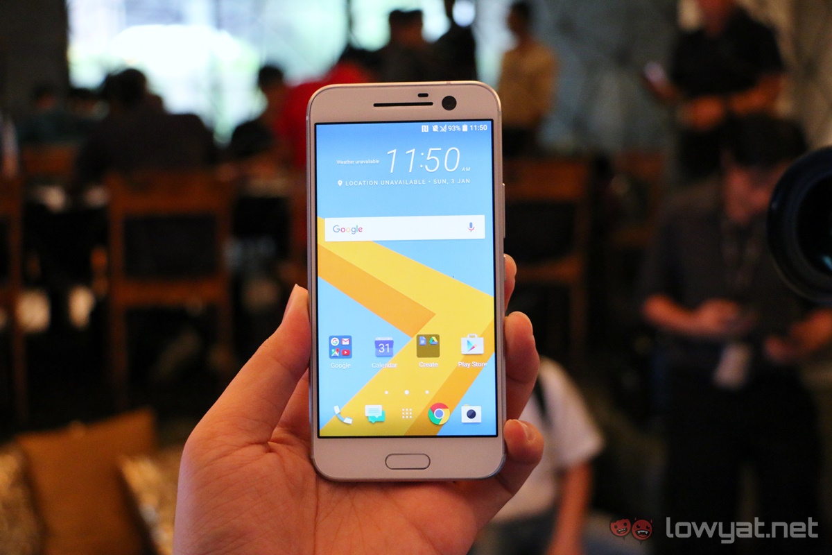
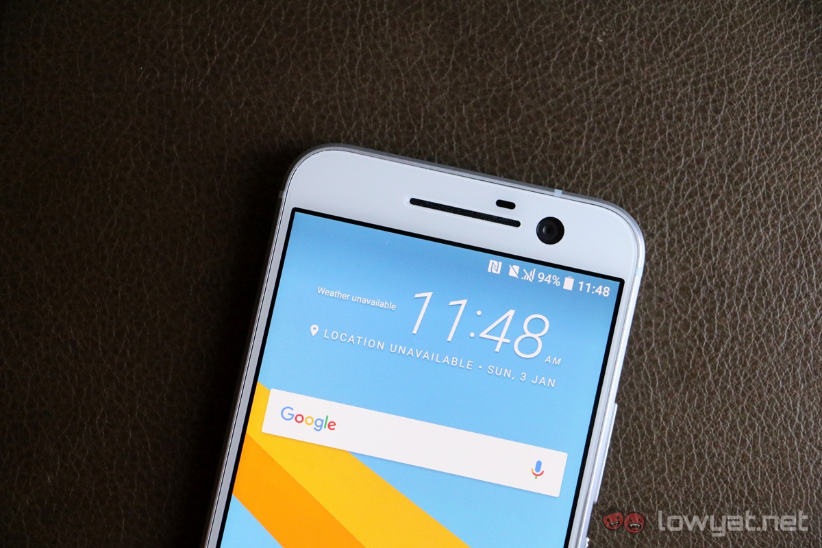
Speaking of which, the HTC 10 is actually only slightly smaller than the Galaxy Note 5. It is likely different internally, but from the thick upper and lower bezels it does appear that the design could have been a bit more efficient, and resulting in a smaller overall footprint. Nevertheless, the HTC 10 is a comfortable phone to hold, with its curved metal back.
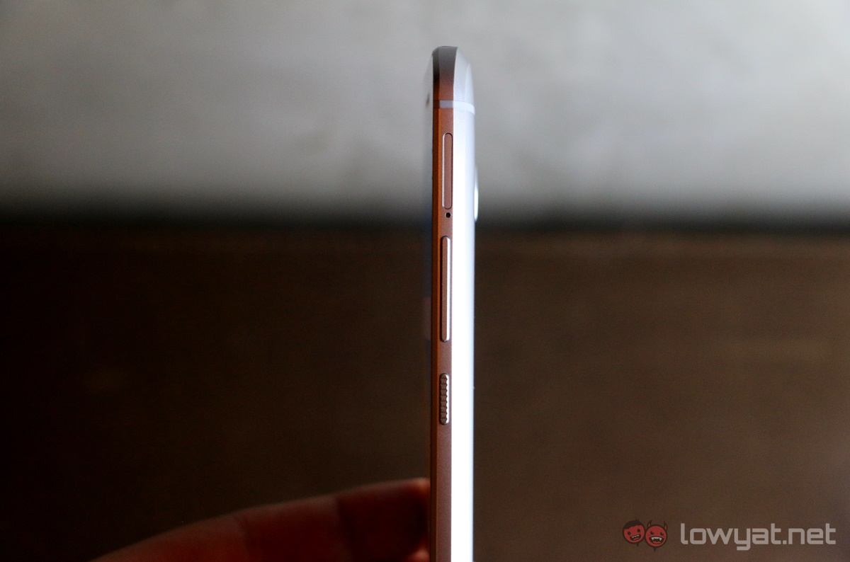
The buttons are all placed on the right side, with distinct textured power button for easy recognition. And here’s what I really like about the buttons on the 10: they’re delightfully crunchy. Each press is assured, with a strong tactility to it. It’s a similar feeling to typing on a mechanical keyboard: once you’ve tried one, you’ll immediately notice the difference when using a membrane keyboard.
The HTC 10 comes in three colours: Glacier Silver, Carbon Gray, and Topaz Gold. They each have a handsome sheen that complements the metal body, and look fantastic in photos. The Gray, while subdued by nature, is particularly fetching in the sea of white and even pink phones we have today.
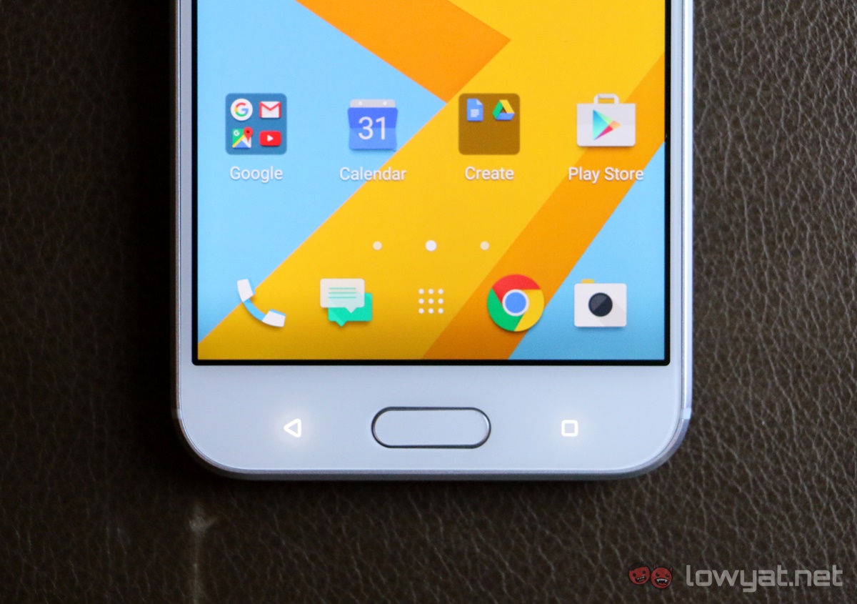
At the media event, HTC made a strong point that it worked closely with Google to ensure the user experience is as smooth as it can possibly be on the 10. Despite running on HTC Sense, HTC removed quite a number of its own apps, such as the Gallery and Calendar apps, and use Google’s apps instead. According to a HTC rep, this meant up to a 30% increase in loading times.
HTC Sense has never actually been an issue as an Android skin: it is always reliable, light and has strong community support. On the 10, there’s a strong stock Android feel, and I’d arguably say the animations are zippier here. It almost feels like HTC increased the animation speeds to catch up with load times.
Thankfully, HTC did not use the stock Android camera app, and used its own. The UI is fairly different, but will be familiar for HTC users. The camera is quick to load, but is noticeably slow to adjust its colour balance as you move the camera around different light sources.
Tapping on a point in the frame not only adjusts the autofocus, but an exposure slider will also appear. Here’s one problem: instead of a dynamic slider that you can slide up or down depending on how high or low you swipe, the exposure slider here goes in steps: swipe up or down once, it moves one step above or below. It disregards how long the swipe is, which means it can take a while to get your desired exposure – and that’s frustrating.
These were the two issues we noticed with the camera immediately, because the lighting at the venue where the event was held was warm and dimly lit. We’ll be exploring the camera a lot more as we conduct a full review.
Speaking of cameras, the 10 is the first camera in the world to actually offer optical stabilisation on both the rear and front cameras. It probably helps explain the large camera cut-out at the top of the display (and perhaps also the thick top bezel).
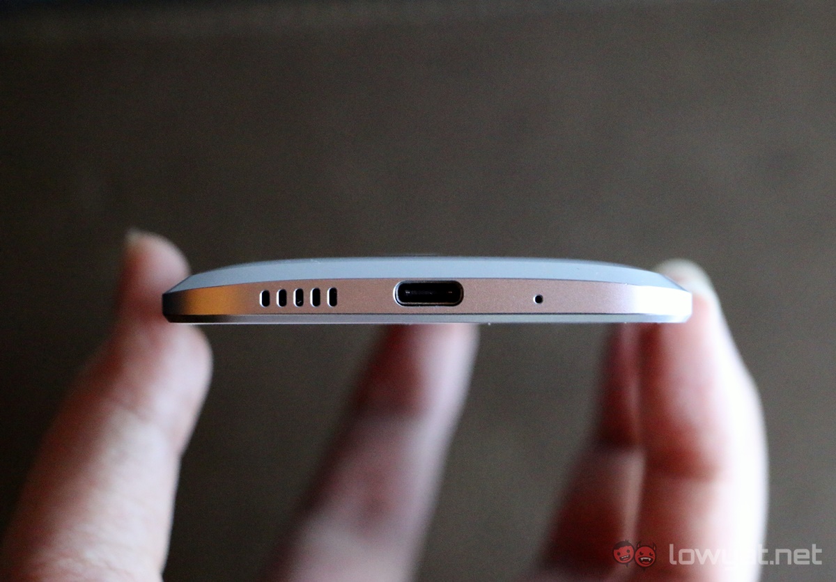
Another reason behind the bezels could be hiding underneath. HTC has retained BoomSound speakers on the HTC 10, but you won’t find front-facing stereo speakers on this model. That’s because HTC has re-engineered the speakers: the bottom speaker grille hides an amp, while the single speaker lies underneath the earpiece.
In addition, the HTC 10 also supports Hi-Res Audio, with a dedicated audio chip built in. HTC also bundles in a pair of in-ears that support Hi-Res Audio.
But what I really like about what’s in the box is actually the charger: it’s a Qualcomm-certified Quick Charge 3.0 plug, which allows it to charge the 10 from 0-50% in 30 minutes – not bad for a 3,000mAh battery charged over USB Type-C.
Yet, I’m still cautious about the HTC 10. Its predecessors promised just as much, but eventually delivered less than the sum of its parts; it is one of the main reasons HTC are in the position it is in today. The RM2,799 price tag doesn’t help either. That said, there is reason to believe the 10 will not be another flop – there’s only one way to find out:
Stay tuned for our full review!


No comments:
Post a Comment